Telemedicine has been around since the beginning of the 20th century when the invention of the radio sparked the imagination of early innovators to reimagine the future of medical care. Fast-forward to the 1940’s when the first radiology images were sent 24 miles between two townships via telephone line, marking the first example of electronic medical record transfer.
By the 1950’s clinicians at the University of Nebraska were the first to use video communication for medical purposes. A two-way television was used to transmit information to medical students across campus. Just five years later, they linked with a state hospital to perform video consultations.
Popularity continued to grow, especially in rural areas. Eventually this spread to urban areas where it was adopted in the world of emergency medicine. Today, telehealth resembles the past but with a modern twist. The use of tablets and smart phones allow for unprecedented access to care while maximizing convenience.
In 2018, QLI saw the impact of telehealth and doubled down on its commitment to delivering life changing rehabilitation and care by using technology to add another level of care. Based in Omaha, NE, QLI is already a leader in rehabilitation and residential care services due to its proprietary clinical model and a work culture that’s second to none. As a pilot project, an entirely new company was formed to focus on the virtual delivery of rehabilitation services not only to support the core mission of QLI, but also to grow and take on its own identity.
After years of simulating home and community environments in a clinical setting, our founding team of clinicians put its own spin on telemedicine. A virtual extension of QLI’s industry-leading Tri-Dimensional Rehabilitation program, QLI Telerehab is a creative solution to deliver meaningful outpatient therapy in a functional, real-world setting – no matter where someone calls home.
Founded prior to the COVID-19 pandemic, which was declared a national emergency in March of 2020, QLI Telerehab was born out of creativity, not crisis. What was initially considered a completely new way of delivering services became a necessity, and due to the pandemic, the need for socially distanced rehabilitation, adoption of virtual meetings across all industries, and liberalization of reimbursement drove significant growth throughout 2020 and into 2021.
With the clinical expertise already in place, QLI Telerehab already had the infrastructure needed to respond immediately to the demands for rehab services, which provided unprecedented access to specialized therapy. Using an accessible video platform, QLI provides care for the most complex neurological, limb loss and orthopedic injuries helping clients apply the skills traditionally practiced in the clinic in their own home and community.
Significant milestones over the last three years include:
- PT, OT, Speech, and Psychology licensure expands to ensure national coverage
- Credentialing and agreements with major worker’s compensation payors and commercial insurance companies are established
- The company grows from three to 11 team members
- QLI Telerehab rebrands to Kintinu Telerehab
The Kintinu Name
We carefully chose our name and crafted our brand to reflect our personality and approach.
The name ‘Kintinu’ draws upon the root word ‘Kin.’ What we love about ‘Kin’ is that it signifies the importance of personal connection (kinship) and hints at the study of motion (kinesthetics). It says, ‘We have your back, even when times are tough,’ and ‘We meet you where you’re at to help you move forward’ – a powerful message.
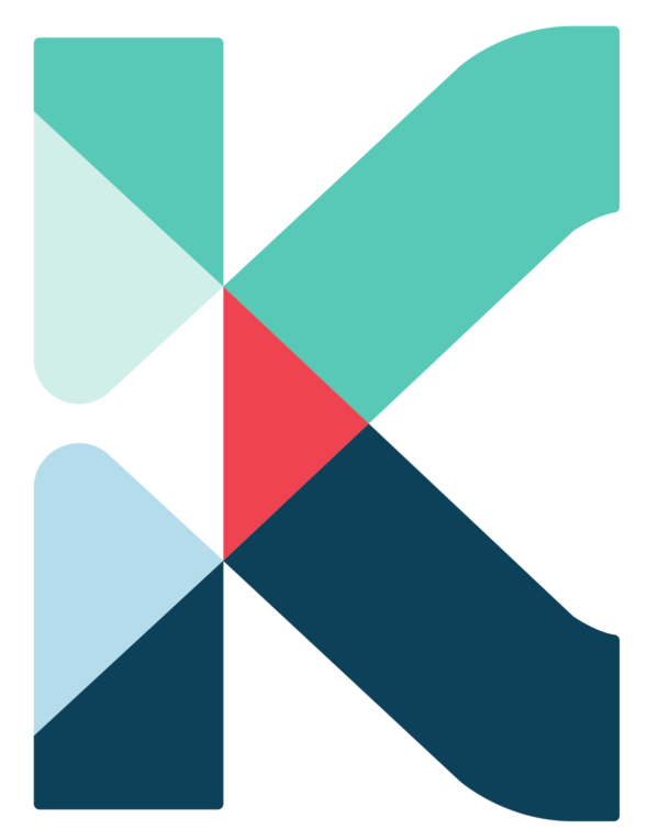
Our visual identity is anchored by two “K” logos paired with our signature brand palette, which includes the colors navy blue and teal. The secondary palette incorporates the colors crimson, peach, and water. Neutral colors of white, light beige, and gray are terrific tertiary colors used to bring the brand to life.
Beyond the name, we paid special attention to the brand voice, messaging, persona, and attributes, including everything from the logo design, colors, and fonts. Each aspect communicates what we’re known for, our personality, the attributes, and characteristics of our brand.
Kintinu…
is inspiring, friendly, engaging, and confident.
uses language that is authentic, sensible, and accessible
strikes a tone that is honest, direct, relatable, and warm.
engages, educates, empowers, and creates hope.
is young and innovative, playful, sophisticated, and just a touch rebellious
Kintinu Brand Attributes
Our brand attributes include:
- Knowledgeable/Bold/Smart – We are experts in our field and lead the way by utilizing technology to address practical challenges. We educate and collaborate with our clients to deliver the best possible outcome.
- Innovative – We are reinventing the outpatient therapy experience through creative use of technology and a commitment to learning and progress.
- Driven/Ambitious – We are determined to provide the most comprehensive and effective rehabilitation through real-world, contextual learning, and individualized treatment plans.
- Passionate/Bright/Active/Positive – We’re energetic, optimistic, and open to learning. We value relationships and focus on the real-world skills and interests that bring purpose, passion, and hope to our clients’ lives.
Mission, Core Values, and Leadership Principles
QLI’s mission, core values, and leadership principles have guided Kintinu from the start and have been crucial in providing a basis for building a culture reflective of what QLI has fostered over the past 30 years. With the growth and evolution of the Kintinu team and brand, we developed cultural values and a mission statement to reflect our identity. An iterative process over the course of several months helped us gain clarity on our core focus as well as a small set of unique, vital, and timeless guiding principles for our organization. The six principles are represented by the individual teal and blue pieces of the multi-colored “K” logo.
“When the bones are good, the rest don’t matter.”
‘Kin” is at the root of our company name and signifies the importance of connection, community, and a sense of belonging. We strive to develop and maintain deep, meaningful relationships with each other and the individuals we serve. These are the “bones.” Like a healthy family or a best friend, we put others first and remain honest, transparent, and caring in our actions even during the toughest of times.
Maren Morris says it best…
When the bones are good, the rest don’t matter
Yeah, the paint could peel, the glass could shatter
Let it break ’cause you and I remain the same
When there ain’t a crack in the foundation
Baby, I know any storm we’re facing
Will blow right over while we stay put
The house don’t fall when my bones are good
Watch it on YouTube
Read the Full Lyrics
Trust in Truth and Transparency
Ray Dalio says, “Meaningful relationships and meaningful work are mutually reinforcing, especially when supported by radical truth and radical transparency.” There’s no doubt we look forward to celebrating milestones and traditions but being part of a “family” also comes with some tough love too. In the end, we believe the “work” we do will be even more rewarding if we demonstrate strong character by committing to both.
Learn more on LinkedIn
Lead Like Lasso
Ted Lasso leads with a winning combination of heart and humor. Despite his lack of experience with English football and seemingly unsophisticated approach, he focuses more on the people and the process rather than the outcome (winning). He consistently shows up with infectious optimism and energy, hardwired empathy for others, and a love for coaching – all good enough to instill a healthy team culture. Nothing is more fitting than a witty metaphor (err simile) to help us remember how to “show up.”
Learn more on TV Insider
Watch it on YouTube
Be Curious like George
George is a curious little monkey always embarking on adventures and exploring the world around him with wonder and intrigue. His irresistible qualities – ingenuity, opportunity, determination, and curiosity paired with a bit of mischief inspire us to remain young, playful, and innovative all while maintaining a level of sophistication and focus that shows we take what we do seriously.
Read more on The New Yorker
The ‘Big Fundamental’
Quite simply the most accomplished power forward in NBA history, Tim Duncan became the league standard for longevity, loyalty, and sustained success. Known as ‘The Big Fundamental,’ he would eat opponents alive by doing the small things right. Never caught up in self-promotion, Duncan was a perennial all-star who always put his team first. One of his greatest qualities was his mental and physical toughness. Shaquille O’Neal applauded him saying, “You couldn’t break him. No matter what you did to try to throw him off his game, he would just come back and give you his best.”
Read more on TheUndefeated.com
Fueled by Heart
The Tin Man traveled all the way to Emerald City in search of the Wizard of OZ to find his heart. Ours has fueled us from the beginning. Heart symbolizes genuine consideration for each other’s well-being, a never-quite satisfied attitude, and the determination to maintain high standards and accountability. We’re “following the yellow brick road” in constant pursuit of excellence with our eye on our mission, instead of Emerald City.
Watch it on YouTube
Our mission, “Shape lives – virtually anywhere.” is represented by the crimson triangle. It’s at the center of it all and ensures we remain laser focused on what matters most.
Backed by decades of experience producing exceptional clinical outcomes, we’re excited to continue connecting therapy to everyday life and meeting our clients where they’re at – no matter where they call home. We believe this is how extraordinary outcomes are achieved.


